Build It:
Creating a Scalable Web Application
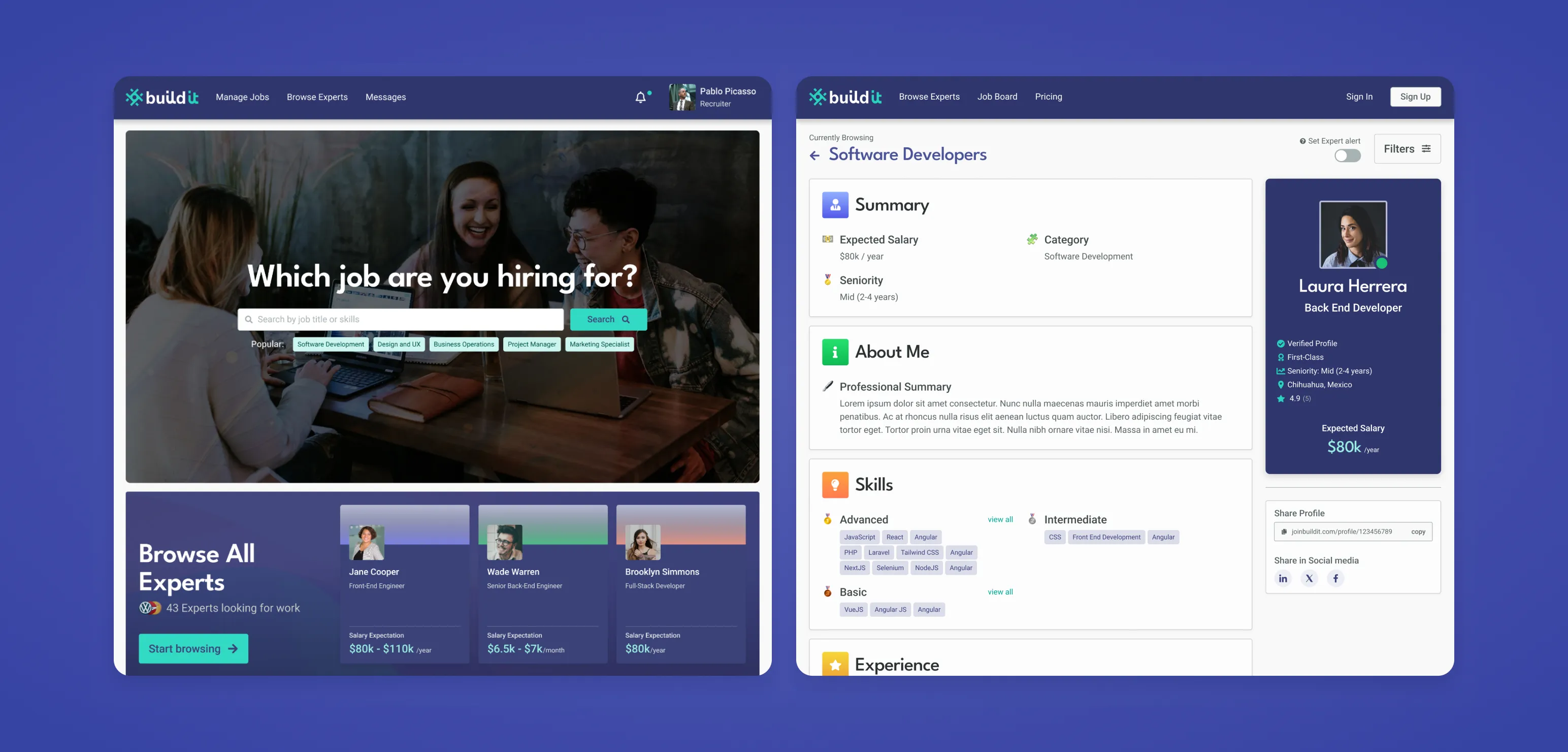
Helping companies to easily browse, like, and match with qualified Mexican tech talent.
Design Systems
UI Design
UX Research
Written by
Luis Angel Gonzalez
Published
02 Jan 2022


Helping companies to easily browse, like, and match with qualified Mexican tech talent.
Written by
Published
To scale effectively with the design and engineering departments, a design system was built from scratch to meet current and future recruiting needs for our clients.

Problem: Build It did not have a reliable service that could handle hundreds/thousands of applications. We recognized the need for a robust service given the dynamic nature of the human resources industry. The ability to fill multiple positions concurrently is essential and building a scalable system was a key objective for our platform.
Our goal was to create a design system that can control the entire suite of products (web app/marketing campaigns/emails). We wanted to have dynamic components that can scale and adapt to positions and talent available inside the platform.
Said design ecosystem would be an automation tool that helps us provide coherent design choices that will scale in the future. At Build It, we challenged ourselves to close the gap between design and engineering to have constant changes deployed and so, in a matter of months we had an MVP that was iterated with research and metrics in mind.

Research obtained through primary and secondary research:


A design system was made from scratch based on users' needs and wants. Technologies used for this solution include Ruby on Rails for the functionality of its components, Bulma CSS and SASS for the customizable aesthetics and flexible styling classes, ViewComponent framework for quick component and encapsulated components, and Atomic Design Principles and BEM model for naming conventions, organization, and documentation.
The main benefit of creating this system would be consistency. However, we still have other compounding wins such as:


Brad Frost's principle, Atomic Design, helped us generate future-proof solutions. This concept divides digital interfaces into subsets that change dynamically to save time in production:

These are some of the results directly and indirectly made by the creation of our in-house design system:

We constantly kept in mind the importance of closing the gap between engineering and design principles through:
User testing should be at the core of every digital product to know about the constraints and possibilities of our designs. Therefore, at Build It, we are constantly testing and validating design solutions to provide accessible and user-friendly interfaces.